HERO (Full Width)
Layout:
- Full-width section
- Background: Final “Laugh Across Ohio” flyer (slightly dimmed)
- Overlay: black gradient
Content (Left aligned – Cols 2–7):
H1:
When Good Design Isn’t Enough
Subhead:
A case study on direction, not just design.
Meta line:
March Madness 2 / Laugh Across Ohio Campaign
CTA Button:
→ Start the Breakdown
QUICK SUMMARY (Skimmable Hook)
Layout:
- 2-column
- Left: text
- Right: stacked visuals (3 concepts)
Copy:
Headline:
The Problem
Body:
I created multiple concepts, motion graphics, and promotional assets for this campaign.
But the show didn’t land the way it should have.
Not because the design was bad—
but because the direction wasn’t clear.
PROJECT OVERVIEW
Layout:
- 3-column icon/text blocks
Content:
Client: Independent comedy tour
Scope: Flyers, motion graphics, social media
Timeline: Extended (due to direction changes)
THE REAL ISSUE (Anchor Section)
Layout:
- Centered text (narrow width)
Copy:
Headline:
The design wasn’t the problem. The direction was.
Body:
Before opening any design software, the core questions weren’t clearly answered:
- What is this show?
- Who is it for?
- What should people feel when they see it?
Without that clarity, every design direction became a guess.
CONCEPT 1 (Stranger Things Inspired)
Layout:
- 2-column
- Left: large image / motion stills
- Right: text
Content:
Headline:
Concept 1: Cinematic / Sci-Fi Direction
Body:
Inspired by Stranger Things, this concept leaned into a dark, cinematic tone.
What worked:
- Strong aesthetic
- Cohesive visual language
- High production value
What didn’t:
- No connection to the show
- Didn’t communicate location, lineup, or tone
- Prioritized style over clarity
CONCEPT 2 (Bento Layout)
Layout:
- Reverse columns (text left, image right)
Content:
Headline:
Concept 2: Editorial / Film Poster Layout
Body:
Inspired by the structure of Babel, this approach focused on storytelling through composition.
What worked:
- More information
- Flexible layout
- Strong composition
What didn’t:
- Increased complexity
- Still lacked a clear message
- Didn’t simplify the decision for the audience
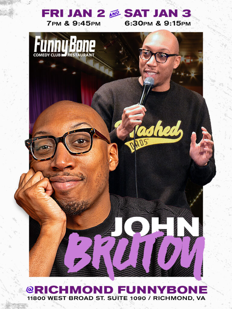
FINAL DIRECTION
Layout:
- Full-width image (final flyer)
- Text underneath (centered)
Content:
Headline:
Final Direction: Laugh Across Ohio
Body:
This version worked because it focused on clarity:
- Clear name
- Updated headshots
- Straightforward messaging
The audience could immediately understand what the show was and why it mattered.
THE COST OF UNCLEAR DIRECTION
Layout:
- 3-column stats or callouts
Content:
- Multiple redesigns
- Wasted production time
- Delayed rollout
Supporting line:
Getting to the right solution took longer than it should have.
KEY LESSONS (High Value / Shareable)
Layout:
- Vertical list (icon + text)
Content:
1. Lock the concept first
Don’t design until the direction is clear.
2. Explore fast, not fully
Rough ideas before polished execution.
3. Clarity beats creativity
If it confuses, it doesn’t convert.
4. Solve the problem first
Design is communication, not decoration.
PROCESS (Positioning You as Expert)
Layout:
- Numbered steps
Content:
My Updated Workflow:
- Define the objective
- Lock the name and positioning
- Identify the audience
- Sketch rough directions
- Execute ONE direction fully
CTA (Conversion Section)
Layout:
- Centered
- Clean background
Copy:
Headline:
Need help with your next campaign?
Body:
If you’re promoting a show, building a brand, or struggling to get traction—clarity comes first.
CTA Button:
→ Start Your Project
(link to Creative Brief)
RELATED POSTS / NEXT READ
Layout:
- 2–3 post cards
Suggested posts:
- “What Makes a Flyer Stop the Scroll”
- “Fixing Bad Promo Designs”
- “Design vs Communication”
🏷️ BLOG CATEGORIES (Important for SEO + Structure)
You want 3–5 max, not too many.
Primary Category (Choose ONE):
- Case Studies ✅ (Best choice)
Secondary Categories:
- Graphic Design
- Marketing Strategy
- Branding
Optional (if you want niche authority):
- Event Promotion
- Creative Process
🔍 SEO TAGS / KEYWORDS
Use variations of:
- comedy flyer design
- event promotion design
- why flyers don’t work
- graphic design case study
- branding for events